Pie Chart
Create Pie charts to enhance your documents and add authority to your statements
As seen on:


What are pie charts?
Pie charts are commonly used in presentations and reports to show data in a visual way. They’re the ideal way to show a percentage breakdown of your data, giving perspective to your numbers at a glance.
A typical example of pie chart would be a breakdown of a population into age groups. Each age group would be shown as a slice of the pie, the size of the slice representing the age group’s percentage of the total population pie. The visual approach will make it quickly obvious which age groups are predominant.
Pie charts are also popular for displaying the results of surveys. A visual display of your data in a pie chart will always be far easier to digest than a list of percentages!
Why use pie charts?
1. They are clear
Most people don’t have time to dig into mountains of data to find the information they’re looking for.
By using a chart instead of a data table or multiple lines of text you’ll save your readers a huge amount of time and effort. And they’ll thank you for it!
2. More convincing
When you’re using data to make a point or convince someone to adopt a plan, you’ll find it’s always more effective to put things in perspective. Pie charts are perfect for perspective.
3. More likely to be read
Charts and diagrams will always make your document more interesting, and the subtle introduction of colors can make your document visually attractive. Net result, it’s more like to be read.
4. Easier to remember
We are far better at memorizing images than text or numbers. By turning your information into a visual, you are making it easier to remember.
When to use pie charts?
- Your values show a relevant difference – If for example you are comparing 3 segments that are 31%, 35% and 34% of the total, the visual difference will be very small and the chart hard to interpret. If you values are similar then pie charts aren’t a good option, and a bar graph would be a far better choice.
- You want to compare each part to the total – Let’s say your company has 3 products and you want to show how the sales of each product count towards total revenue. In this case a bar chart might be the best way to show it visually. For example, if you want to compare this year’s sales to last year’s, then a stacked bar chart makes sense.
- You have a limited number of segments – Pie charts aren’t really suitable for displaying more than 10 slices. Beyond that it simply becomes confusing, as the slices become too small to tell the difference between them and draw any conclusions. For data with more segments, a table may work better.

Common mistakes to avoid
Using incomplete data – A pie chart is a whole, and therefore your data should always include the whole. If you find you have less than 100% of the data, it’s best to use another type of diagram or a bar graph, since a pie chart with missing data will make things more rather than less confusing.
Using too many slices – If you need to show more than 5 or 6 slices in your chart, consider using tables or bar charts instead. If you still need to use a pie chart but have too many slices, try to merge slices in a way that makes sense.
Forgetting how the pie chart will be consumed – If you’re including pie charts in a report that’s going to be printed, keep this in mind when choosing the colors of your segments. If your document is going to be printed in black and white you need to check what your colors will look like when converted into black and white; is there enough contrast to ensure the chart can be understood. Play with shades and tints to avoid this problem, and test print it yourself to make sure it works.
Failing to explain enough – Make sure you add all the information required to interpret your chart. This includes a clear title, and a legend explaining the different parts of the chart. And note that the legend position can also help to make the data clear (the best is as close to the slice as possible). Sometimes you might want to add a few lines highlighting the conclusions.
Not showing where the data comes from – Although not necessary in every chart, it’s good practice to include information about the source of your data. What’s more, if the data has come from a trusted source, it can add more authority to your chart. Often the source can be placed in the captions of the chart.
Pie charts template
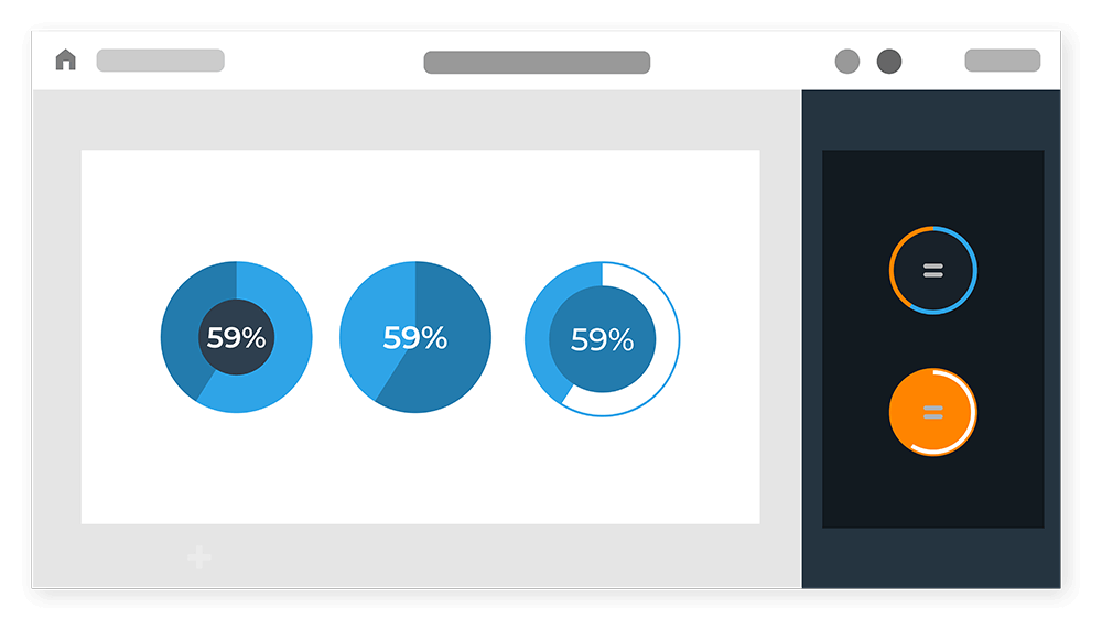
You can customize every detail about your pie charts, from fonts to text colors, text size, lines, background etc.
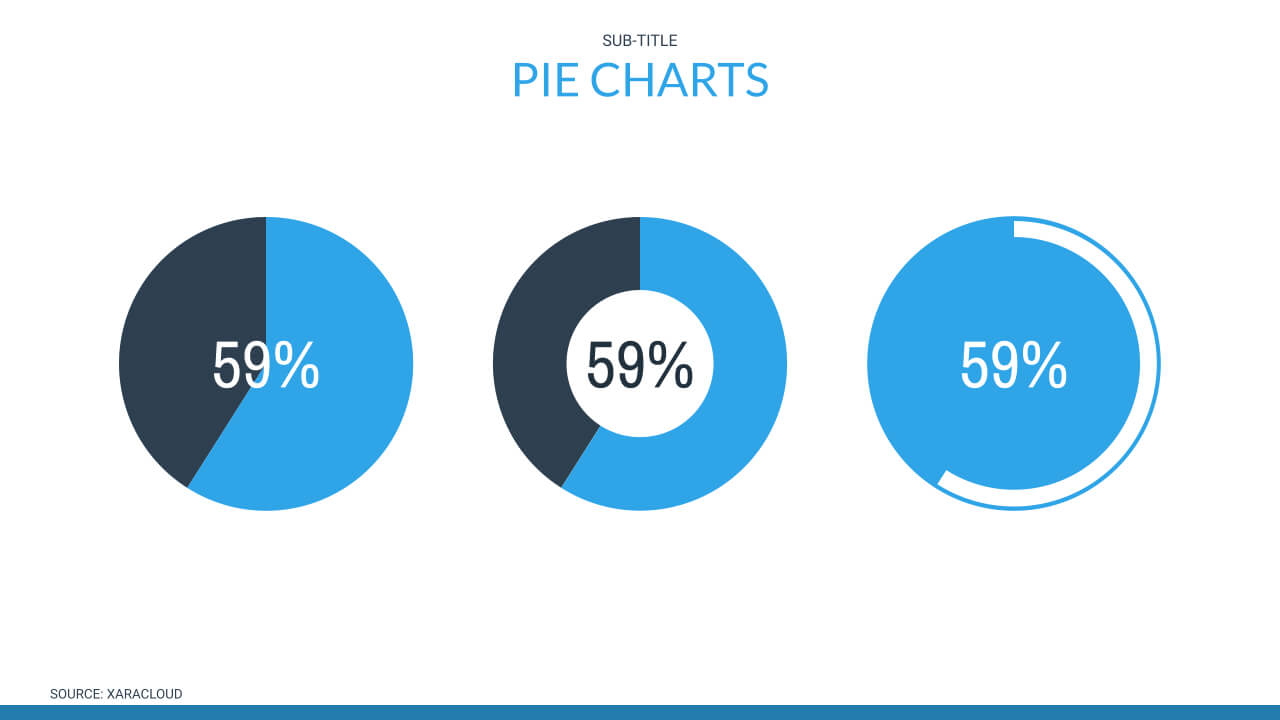
How to How to create Pie charts in Xara Cloud
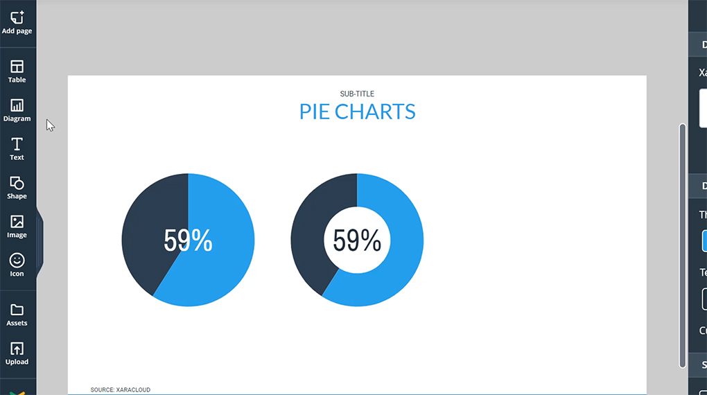
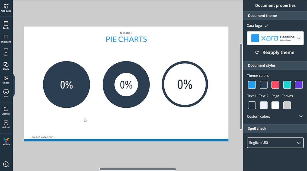
1. Go to diagram > chart, then drag and drop to add pie charts
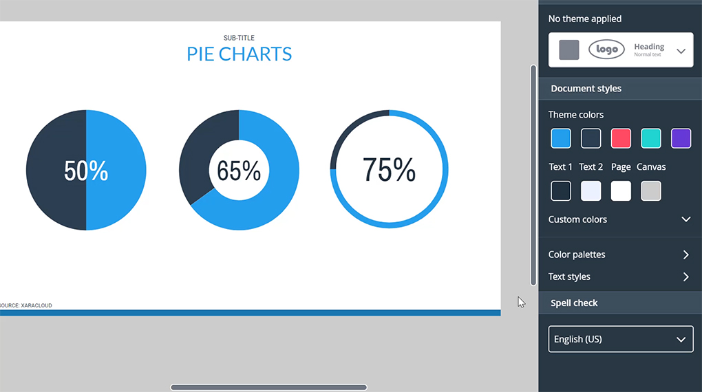
2. Change the percentage by dragging the handle or typing your desired number
3. To ensure consistency Xara Cloud documents have a color palette that’s used by all the elements or simply use your brand
Create Pie charts in Xara Cloud
Our templates are carefully created by design professionals, so you can be confident that your documents will always look professional and on-brand, no design experience required.
You will find a library of diagrams in Xara Cloud including pie charts and bar charts. Simply choose one of our pie chart templates and enter your data. Use Xara Cloud as you pie chart maker and you’ll soon be downloading your chart – or even better, use one of our document templates and add your customized charts to make it even more compelling.

