3 min read
Early 20th-century artist and theorist Wassily Kandinsky once said: “Color is a power which directly influences the soul.” There is an eternal truth to this saying, so much so that it is also reflected in the language we use to talk about ourselves — we are green with envy, we have the blues, we see red. We put on our rose-colored glasses when we want to ignore the negative aspects of life, and we show our true colors when we reveal ourselves as we really are.
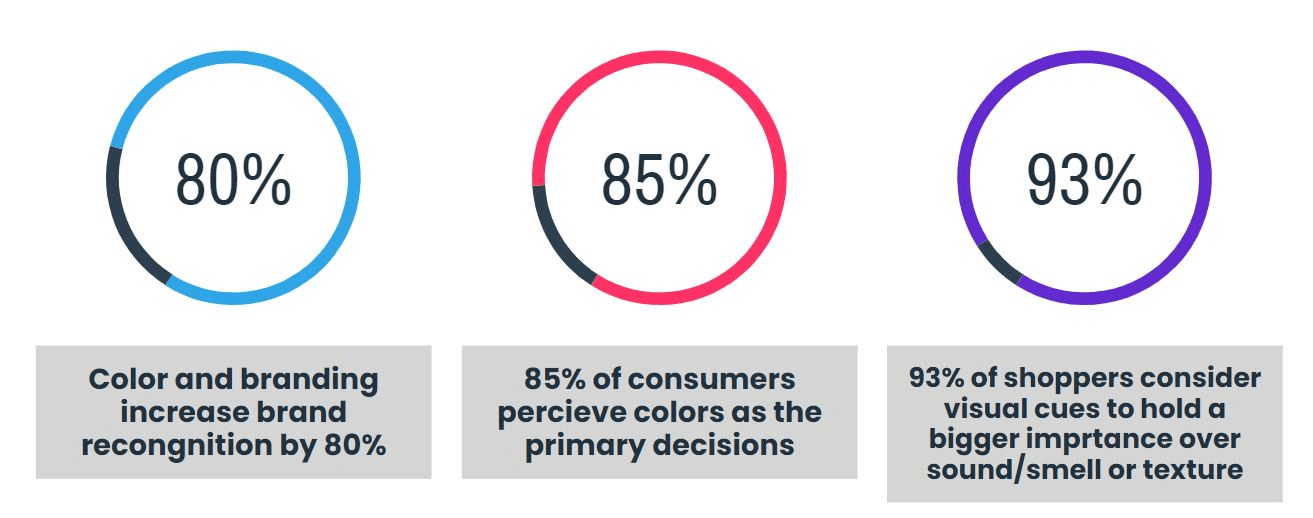
In life, as in art or language, colors go beyond our visual realm and influence our day-to-day experiences. We see colors, but they seem to look back and drive our behavior. In fact, studies show that color and branding increase brand recognition by 80%, and 85% of consumers perceive colors as the primary decisions for buying a product. To add to this, 93% of shoppers consider visual cues to hold a bigger importance over sound, smell, or texture when it comes to what they purchase.
With the stakes so high, it makes no sense to leave the brand color palette up to chance. After all, the color you choose will appear on your website, logo, social media, and all the business materials. But since it plays such an important role in your brand identity, you want to make sure you get it right. So let’s delve deeper into how you can choose the best color palette for your brand
The Basics of a Brand Color Palette
Your brand identity color palette should achieve two things. (1) Create a vibrant experience for your prospects. (2) Reflect on your brand identity and what makes you unique. Once you strike the right balance between the two, chances are that your brand will be remembered and you are well on your way towards building a solid customer base.
But this is easier said than done, especially since some colors trigger emotional responses that are beyond our control. So it’s important to choose the color that drives the most impact. After all, studies show that up to 90% of snap decisions are made based on color alone.
Let’s see what are the most common associations people make when they see a certain color:
- Red: Could be associated with passion, excitement, or anger. It stimulates the human body and pulls in focus immediately.
- Orange: It’s an invigorating and playful color. It encourages bold acts and is seen as healthy, energizing, and attention-grabbing.
- Yellow: In spite of its youthful and cheerful connotation, yellow is usually used as an accent in order to pull the attention towards a certain element.
- Green: Usually associated with sustainability, nature, and wealth. In stores, it is often used to relax consumers and the most common connotations are professionalism, authenticity, and trustworthiness.
- Purple: It’s the go-to color if you want to convey luxury, opulence, and indulgence. It triggers the problem-solving area of the brain and is usually used in beauty and anti-aging products.
Naturally, choosing a brand color palette does not mean that you stick to your favorite colors. You have to consider the bigger picture here and the way different shades look next to each other. After all, the choices you make will determine if your brand will stand out or get lost in the crowd.
What Brand Color Palette Are You?
The Monochromatic Type
You have a powerful personality trait and you rely on it. You opt for a sleek and minimalist look for your brand and use different shades of the same color to create the contrast you want. Nonetheless, you sometimes find it difficult to make all branding elements to stand out.
The Analogous Type
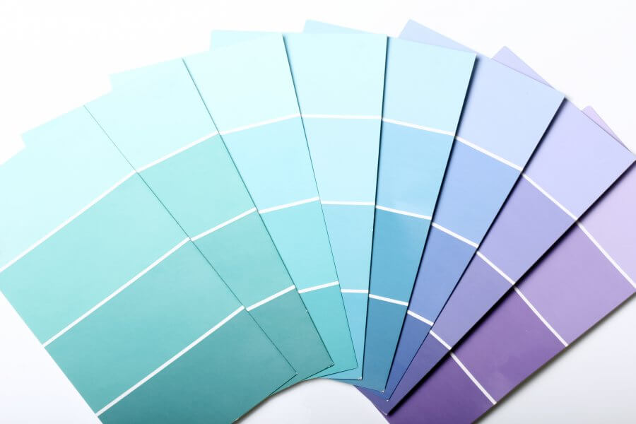
You like to use shades that appear next to each other on the color wheel. You use them because they have consistent emotional connotations that are pleasing to the eye. Analogous colors allow you to be on the safe side but you might find it difficult to draw attention to certain brand elements
The Complementary Type
You go for colors that are on the opposite end of the color wheel to create a striking contrast. You like a dramatic look that helps each color stand out when put next to each other. This pairing allows you to be visually and expressive when it comes to communicating your brand personality.
The Triadic Type
You like to diversify and use shades from different parts of the color wheel. You enjoy playing with different colors and generate different meanings when it comes to your brand identity. You sometimes struggle to establish the optimal blend of colors that will allow your brand to stand out.
The Principles for a Successful Brand Color Palette
Very often, businesses think in terms of ROI and building a loyal customer base. Legitimately, this makes business sense. But some brands actually manage to transcend the business reality and drive meaningful changes in the way we experience life in general.
By extending the status quo, successful brand manifestos imagine new realities and disrupt business as usual. It could be a more sustainable future, better employee welfare, or closing the gender pay gap. Setting important values at the heart of their purpose is likely to resonate with their target audience and lead to a better future.
- Start Slow and Build with Caution
More colors, less brand identity. As in, the more colors you chose, the less likely you are to stand out from the crowd. The most successful companies out there — such as IBM, Orange, or IKEA — chose one or two colors to represent their brands. You can expand, but do not go beyond four colors because this might backfire. To get started, think about your brand and what you want to convey first. If you believe in nature and sustainability, you might want to choose green as the foundation for your color palette. From there, you can add other hues to highlight or complement the main shade. No matter your choice, it’s important to align the emotional connotations of the colors with the traits you want to be recognized by and target audience you are appealing to. - Do Your Research
Once you have a few solid options, you should conduct extensive research to see if they would appeal to your target audience and help you stand out. By the end of your research, you should know the following:- Your customers’ preferences: What shades are likely to prompt them to engage with your brand? What associations will they make? How will they position your brand in relation to your competitors?
- The color palette in your competitive landscape: Your brand color palette should knock out the competition, not help consumers identify with it. If all sustainable companies chose green as their go-to brand color, the landscape would look pretty monochromatic and no one would stand out. So look at the colors they choose and determine if you should follow in their tracks or choose a different route.
- The works of the marketplace: Are there any ground rules that apply to the industry you operate in? Are there any cultural implications of the colors you choose? Will they change if you decide to expand? For example, white is associated with purity in Western countries and with death in the Eastern ones.
- Consistency Is Key
It is being said that repetition is the mother of learning. This is also true for successful brands that repeat the same brand elements to make them stick in the eyes of the consumers. You can change the brand colors with time, but this comes at serious risk. And consistency does not apply just to the color itself. If you say “green” to a designer, he could think of lime green or forest green. These shades are quite different and if these inconsistencies occur in connection to your brand elements, you might lose trust in front of your audience. To avoid this, you could include the hex values of your brand color palette in your style guide. And remember to use the same colors whenever you can, on your website, social media platforms, or marketing collateral.
Example: Netflix repeats their brand color in every elements so the audiences can easily recognize.

Source: image
What Colors Your Brand World?
Have you zeroed in on your color combination? What color palette are you? Should you opt for a monochromatic look or a triadic one? These are all important questions and the answers will have a significant impact on the way your brand will be perceived. And it’s important to feed these answers into your overall color palette brand identity guidelines.
But taking it easy, doing your research, and being consistent are key elements to getting it right. Are you ready to get started?
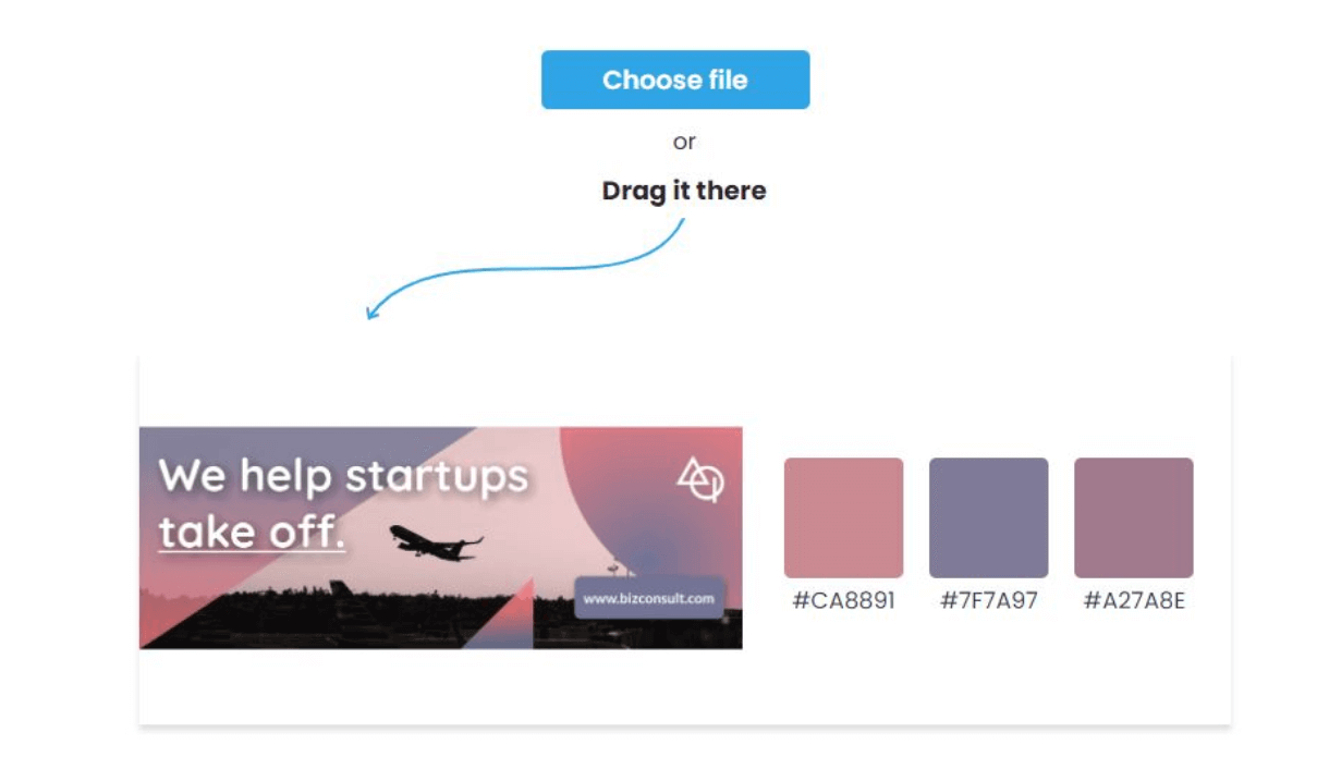
Use image to generate your brand color.. in 3 seconds!
To make sure your business and marketing material looks consistent, you need a brand color palette. Xara offer the easiest way to get your brand colors with free color palette generator. You only need a beautiful picture and our smart system will create your customized palette based on it in 3 seconds.
The Xara branding hub
Whether you want to grasp the basics of branding for your new business, want to work on your brand strategy, are stuck with your brand visuals or want to find branding tips on how to grow your business, check out:
- Foundations — Learn the basics of branding
- Strategy — Plan your brand strategy
- Build Story — Build a brand 1: Your brand story
- Build Visuals — Build a brand 2: Your brand visuals
- Management — Control your brand: Brand management
- Growth — Grow your brand: Brand marketing
- Improvement — Improve your brand: The rebrand
- Measurement — Measure your brand: Brand analytics and KPIs


