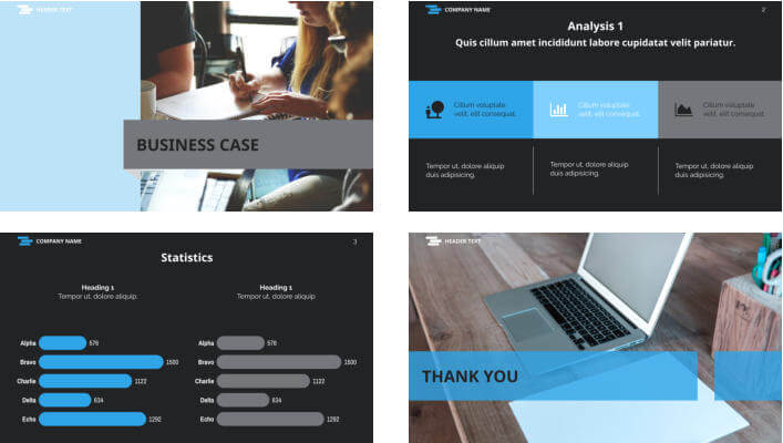
Brand visibility, either personal or corporate is more important than ever in today’s competitive marketplace, especially when presenting either internally or externally.
Ensuring that your personal brand stands out from the crowd is essential. Design is one of the very best ways to get your brand noticed and, thanks to Xara Cloud, professional design is now easier than you might imagine.
We are bridging the gap between business and document design through our template-based software. Read on and learn more about the many ways that good design can attract the attention of your preferred audience while helping you to create a successful brand profile.
1) Make your presentation personal and visual
Your personality is everything, and will play a key role in your brand development. Whether you are an established brand, an individual, or a new start-up, it’s vitally important to consider how you appear to your target audience. While some brands take the ‘bold and beautiful’ or the ‘learned and academic’ approach, others might find that the simple touch is more suited to their customer base.
Perhaps you want to come across as a knowledgeable expert, or maybe your aim is to convey an air of elegance and sophistication. Each of these traits is a ‘design element’ and once you’ve decided on the best way to share your message through your personal voice, the rest becomes easier.

2) Know your audience
Think about who you want to speak to and, above all, be authentic. Understanding your audience is key to planning out the perfect presentation. Who is your audience and what information are they likely to be interested in? If your presentation is aimed at an internal audience stick to key headlines and think about how you can include a few fun elements while still keeping it professional to keep your audience engaged.
For external presentations facts and figures can be the key to grabbing the attention of your audience and winning over potential clients, so it’s worth thinking how best you can present key data in bite-sized chunks, to help give your data the best chance of sticking in the mind of your audience, plus it’s essential to achieve brand consistency across all external documents, so have your logo, brand fonts and color scheme at the ready
3) Keep your style consistent
Make sure each page of your presentation consistently follows the personal or branded style you’ve created. A consistent style helps portray a professional look, build brand recognition and gives you easier design guidelines to follow, which helps make the task of creating powerful presentations an easier one.
Logo placement, color scheme, image style, fonts and icons – these are all elements that should follow the a consistent look and feel.

4) Know what makes a good presentation?
Now you have decided on your brand profile and gotten to know your audience, how do you start? The beginning is always a good place. Let’s walk through the key design features you should consider.
Fonts are important
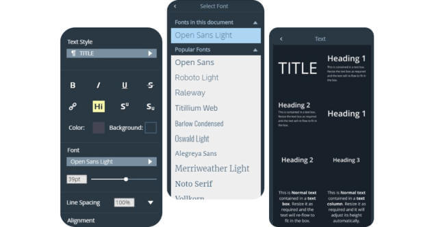
Choose a font size and type that is easy to read – don’t be tempted to choose a smaller font with the intention of cramming in more information. Conversely, the type shouldn’t be overwhelming. Add text that is overly large and you’ll risk losing the attention of your readers.

Don’t be tempted to add too much text
You’ve probably seen presentations that left you cold thanks to the amount of text you had to wade through. Congratulations if you did – most people don’t, they simply lose interest and move on. Paragraphs should always be relevant and make good use of headlines to highlight key information. Don’t stray off subject and use short, sharp sentences for extra impact.
The same goes for figures!
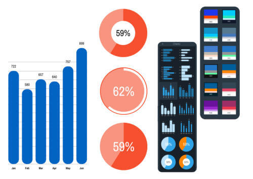
Too many numbers are just as baffling as too much text to the average person. A list of figures isn’t inspiring and, most importantly, it’s not easy to decipher. Use bar charts, pie charts, or flow charts that convert numbers into colors and keep your audience focused. It’s so much easier to see how a product has performed over the past six months when the data is presented as a bright bar chart, for example.

Use color wisely
Color is an important factor when promoting your brand or creating presentations. Choose the colors you prefer for your logo and stick with them. In no time, people will come to associate those shades with your brand. Good examples include Facebook blue and Spotify green. However, when selecting colors for headings, tables, graphs, text, or charts, a feel free to add a splash of creativity to by using colors that might make an impact. Just ensure you are consistent with your color across your documents.
Plain black and white documents are unusual today as they aren’t really considered attention-grabbers. Xara Cloud allows you to create colorful documents and charts. Try to use colors that offer a degree of contrast; or colored sections on a white pie chart, for example.

Add visual content
Xara also makes it easy for you to add images from your cloud storage or our stock imagery library. When adding pictures or illustrative features, consistency is once again the order of the day so photographic content should follow a similar theme throughout. And, naturally, with Xara Cloud you can easily convert photographs to your preferred size.
Enjoy a more successful brand with Xara
More businesses than ever are choosing top business software and tools like Xara Cloud to build their brand’s profile. As well as striking presentations that combine ease of use with exceptional clarity, Xara Cloud offers a fully-collaborative platform for all your most important projects. Your entire team can work together from any location. Create product sheets, SM Graphics, flyers and even eBooks that adhere to US legal sizing and or any custom sized document.
Some of the advantages you’ll enjoy with Xara Cloud include a reduction in the cost of document ownership thanks to not having to employ an entire design team and a recognizable and consistent brand look.
Why risk your brand’s name and reputation on hastily constructed presentations and bland documents? Take the professional approach and elevate your brand profile; create presentations that stand out from the crowd with high-quality templates and advanced features developed for you by Xara Cloud. Want to know more? Take a closer look at the many ways in which Xara Cloud can work for you at www.xara.com.
Sign up to Xara today for a free trial


 No credit card or phone number required.