90% of start-ups fail. And 85% of them go down due to cash flow problems. At this rate, it makes sense that investors are skeptical about pouring their money into new businesses or start-ups. But an eye-catching pitch deck is likely to turn this around.
You can have a revolutionary business idea. Unfortunately, that’s not enough. If that idea doesn’t get through properly, you will lose the fundraising.
For up-and-coming entrepreneurs, the mere thought of THAT meeting with the investors gives you the jitters. However, going in as prepared as possible will increase your odds of succeeding.
Surely, the information you include in the business presentation is vital to the success of your pitch. But investors are humans, just like us. They need visual content to dazzle and engage them, ultimately helping them pay attention
That’s why an eye-catching pitch deck design is essential to get your message across when words alone are not enough . Admittedly, visual content might be the last thing on your mind when carrying out a business proposal. However, there are a few simple steps you can take to create a solid pitch deck that actually raises money.
In today’s article, we give you a comprehensive guide to help you nail the business presentation. Here’s what this guide will cover:
- What is a pitch deck?
- What to include in your pitch deck?
- Pitch deck design tips
- How to save time with a pitch deck template
What Is a Pitch Deck?
A pitch deck, or a slide deck, is a visual presentation that accompanies your pitch. Its purpose is to provide a brief overview of your business. With a pitch deck, you summarize the key points of your business idea, including financial projections, marketing plans, and funding needs.
You can also think of it as a canvas on which you can write the story of your company or idea. This short story can get you a second meeting with investors and the financial funding you so desperately want.
So it better be a bestseller.
What Slides to Include in Your Pitch Deck Presentation
Think of pitch decks as first impressions. They can make or break the deal. While the end goal is to raise money for your business, the momentary purpose is to keep funders engaged.
You want to deliver a presentation so well that they can’t ignore you. And we have the secret sauce to help you succeed. Let’s explore everything you need to include.
1. What’s Your Vision?
We’re not going to beat around the bush. Whether you want to get clients or potential investors on your side, outlining your vision on the first slide is critical.
And it’s a one-liner. This section of your pitch deck presentation should summarize your idea and the value you bring to customers. Truthfully, the savviest entrepreneurs can tell you what they offer in just one sentence.
This is your secret weapon.
To craft an excellent one-liner, you must first think about your value proposition. There are four questions it should answer: what, for whom, why, and how does it stand out? There’s a little trick in the books to make this process easier: involve your team. Book a day out of the office and get those creative juices flowing.
Now, for the tricky part. Crafting your one-liner. For starters, keep it short and sweet. Think of it as a tweet. Use powerful words that can spark the imagination of your prospects. And always, always include your unique value proposition.
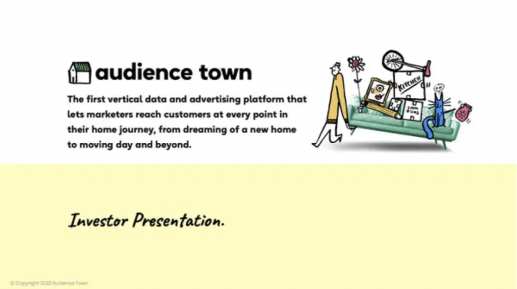
We’ve compiled a few examples of outstanding one-liners.
 Source
  Source
  Source
2. What Problem Is Your Product Solving?
Now is the time to introduce the pain points. What problems is your product or service trying to solve? And for whom?
Again, your storytelling skills will help you with this. Try to tell an engaging story that investors can relate to. Make it real. Ground the issue. This will help potential investors understand the entire picture.
You can briefly talk about how your solution compares to other products on the market, but you will also tackle the competitive landscape later in more detail.
3.Who Is Your Target Audience?
Whether you write a message to a friend or a business pitch presentation, you have to know how to speak with your recipient.
A clear picture of your ideal customer and approximate target market size is necessary for investors. This slide is reserved for that.
Here’s what to include:
- The brand persona
- Target market size
Pro Tip: You might be tempted to define a broad audience. Don’t! Find that niche, that category of customers who will benefit from your product. The fact that a smaller target market doesn’t bring in profit is a myth. An impressive pitch deck is crisp and focused.
4. How Does Your Product Solve Their Problem?
You have built up the tension. Now is the moment to introduce the solution. Making a business presentation is a lot like writing a novel.
Here you can get into all the nifty details about your product or service. Surely, you have to make it short and to the point. Don’t waste any words.
Better yet, do you have a video demo? Include it. Customers and investors alike are keen on it, as video marketing can be more effective. In fact, 84% of customers said that watching a video convinced them to buy a product or service.
5. How Does It Cash In?
Now that you’ve got their attention, it’s time to get into the financial and company development bits of the pitch deck. What’s your revenue model?
This slide shows your A to Z plan for making money. A revenue model should include:
- Where will your income come from in the following years?
- What is your pricing strategy?
- Who pays the bills?
- What are your five-year financial projections?
- What will you spend the money on?
Use data visualization to get your key points across.
6. What’s Your Business Roadmap?
Besides the revenue model, you’ll want to detail the rest of the business plan. This includes the company stage and product development.
The purpose of this roadmap slide varies, depending on which stage your company is in.
For instance, if you already have clients, talk about that.
An excellent idea is to test your product or service first. Lean market validation is essential to a killer business presentation. Venture capitalists want to see what traction the product or service will have on the market.
Mention previous milestones. Identify the stage you’re in and set clear future goals and how you plan on approaching those. All in all, the goal is that investors get a clear picture of your business model and how you plan to grow in the future.
7. Marketing and Sales Strategy
You have your target audience set. How will you reach them? In this section, describe how you will catch their attention and how you plan to sell your products.
In other words, you have to detail the sales and marketing strategy. Perhaps you will rely heavily on social media marketing. Or maybe you will do a mix of social media strategies and event marketing. Whatever you do to bring customers to your website and sell them your product, mention it. Be specific and cut straight to the point.
As a start-up, getting leads and converting them into customers is a real challenge. So you need a solid game plan. You have to show that you know your stuff. It will convey that your vision is worth investing in, since you know which sales channels to use to persuade potential customers.
After all, you might have a revolutionary product and a ground-breaking revenue model. But if your marketing strategy fails, all that effort will be for nothing.
8. Why Are You And Your Team The Right People For The Job?
We would call this section a “collective resume” if you will. Why are you and your team the right people for the job? What makes you stand out in this competitive landscape?
List the key members and explain how their experience can help the company grow. If you haven’t filled all positions yet, talk about what positions you need to fill, and why these will stimulate company growth.
The goal is to present an overview of your team and its purpose within the company..
9. What Are Your Financial Predictions?
The financial slide is by far the most important one, as investors expect to see your financial forecasts. And they want to see realistic predictions. Aim for a three-to-five-year game plan.
Wondering what to include?
✔ Sales forecast
✔ Income statement
✔ Cash flow statement
This isn’t the place to get into too many details. Rather, rely on charts and data visualization to present your forecast. Needless to say, you should be prepared to answer any questions about the underlying assumptions you have based your predictions on.
10. Do You Fit Into the Competitive Landscape? How?
Describe how you fit into the competitive landscape. What are the alternative solutions on the market?
What makes your business stand out? How is your product or service different?
Don’t downplay your competition. Rather, focus on what you can learn from them. After all, competition is healthy. Other businesses are a source of information. Their presence on the market shows that there are potential customers interested in your product.
11. How Will You Use the Money?
The awaited moment has arrived. It’s time to ask for the money that can turn your ideas into reality. This is the ask slide.
What do you include?
- How much money are you looking for?
- How long do you anticipate that the financing will last?
- What milestones will you be able to reach with this sum?
- How will you spend the investment proceeds?
Some Extra Business Presentation Tips
Now that we’ve covered everything you need to know about what to include on a slide deck, we’ve prepared a few extra tips.
The Slide Deck Should Do the Talking Without You
On their own, investors spend around 3 minutes and 44 seconds looking at a slide deck. They should be able to understand your pitch in that crunch of time.
The deck should tell the story of your company, even when you’re not there to present it. If anything, the presentation should enhance the slide deck, and not vice-versa.
Apparently, investors spend the most time on the following slides: financial, team, and competition. Your whole deck should be on point, but you could spend some extra time designing these slides to ensure that everything is sleek and easy to grasp.
Keep the Business Pitch Presentation Updated
The information mentioned in the initial pitch deck may change in time. It usually takes at least a couple of months to get funding.
So, make sure to keep your business pitch presentation up-to-date. The last thing you want is to provide investors with outdated and invalid information.
Share the Pitch Deck with Investors
Speaking of which, it’s mandatory that you send potential investors your slide deck beforehand, or right after presenting. 12% of investors view the business presentation on their phone, while some may have outdated versions of PowerPoint.
Your best bet is to send them a PDF of the slide deck. This way, your deck will remain unaltered, no matter what device it is viewed from.
| With Xara, you can create a pitch deck in seconds. Choose a pitch deck template and customize it. Then, export it as a PDF, and track how investors are engaging. |
5 Design Tips to Build a Solid Pitch Deck
Just as the information you include in the deck will either make investors keen on collaborating with you or keen on showing you to the door, so will the pitch deck design.
Design and copywriting influence the way our message gets through. There are a few aspects you should take into consideration:
1. Less Is More
The art of creating an investment pitch deck lies in its simplicity. Most likely, you’ll get an hour at most with the investors. So, you want to spare time for any questions that may arise.
Also, you don’t want to bore them.
Overcrowded slides are tiring to follow. Try to summarize key points and avoid any unnecessary slides. The fewer, the better.
According to Daniel Eckler, you shouldn’t exceed 20 words per slide.
2. Alternate Font Types and Weights
This makes certain words or ideas pop, and it keeps the audience engaged.
But don’t go overboard. Select 3-4 styles and use these font combinations throughout your presentation. However, keep it consistent. For example, you can use a certain font or font size for certain critical information, and keep the same alignment throughout the pitch deck.
Avoid generic fonts such as Times New Roman or Arial. And, of course, the much dreaded… Comic Sans.
3. Make It Visual
Alternating text with visuals on your slide deck will help investors comprehend your business presentation with ease.
Quality visual content can highlight what often gets lost in blocks of text. So, use visuals to convey numbers and reports, such as revenue or total market share. And if you’ve already settled on your own brand imagery and mockups, it’s best to add them to your slides as well.
| Do you want to create a pitch deck that wows investors? The new Vizzlo integration makes Xara an excellent tool for data visualization. |
4. Color Palette
Try to use complementary colors. This creates harmony and is pleasing, not tiring to the eye. Color theory is your best friend here.
Take a look at Headspace. Not only do they use the same doodle character in most of their illustrations, but they also have a cozy and relaxing color palette.

Source: Headspace
They also use complementary colors in their design, like blue and orange, or purple and yellow.

Source: Headspace
5. Aim for Brand Consistency
Any pitch deck starts with the vibe you’re creating. Believe it or not, investors are just as drawn to consistency and harmony in a presentation.
And brand consistency plays a big part.
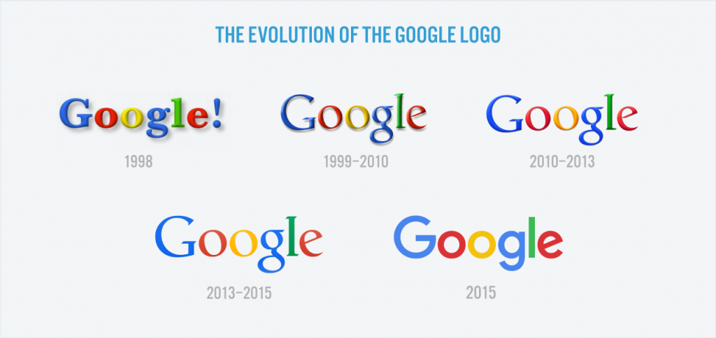
Big brands know this. One reason certain brands pop into your mind is because they follow a pattern when it comes to branding. A brand’s logo, color palette, typography, and images all reflect the brand. The brand elements tell a story.
Take Google, for instance. You know you’re a big shot when your brand’s name becomes a verb. When brainstorming for ideas on how to design your slide deck, some of you might have thought, “Well, I’ll just Google it”.
Throughout the years, Google’s logo has remained consistent.

Source: Springboard
This allowed Google to stand out across a range of different services. Much of the success of the brand is due to its ability to balance consistency with flexibility and innovation.
A business proposal must also reflect a brand’s identity. So, make sure that the fonts, color palettes, and images used reflect who your brand is. Also, include your logo throughout the presentation.
Curious to learn how to create a pitch deck that actually raises money?
Our webinar will teach you all about slide decks, while also including a hands-on tutorial to help you create business pitch presentations with Xara.
Create Your Own Pitch Deck With Xara Templates
Pitch deck presentations can be ackingnerve-wracking. Especially at first. The stakes are high and public speaking might not be your strongest suit.
That’s why you must come prepared and pitch like a pro. In this guide, we offered you a comprehensive look at what a business pitch presentation is all about. But maybe you don’t trust your design skills.
Don’t worry! We got you covered. Our new pitch deck templates can serve as a starting point for your pitch deck designs.
Here are a few pitch deck templates to get those creative juices flowing:
 Source
  Source
  Source
Feeling inspired yet? Just choose a pitch deck template and get started! Head over to Xara and create your first presentation for free.
Sign up today for a free trial


 No credit card or phone number required.