Have you ever been in a meeting, staring at a sea of numbers and data on a screen, watching your audience yawn in despair? Well, you probably didn’t use the right data visualization tools to keep them hooked.
Trust me – keeping your audience’s attention while presenting complex data is possible.
Not everyone is a statistician to grasp numbers and data with ease. But we are all visual creatures. And that’s the secret to effectively communicating your message – whether in a business pitch or through a social media post.
But, let’s face it, not everyone is a designer. What if I told you that creating beautiful and effective comparison tables and table charts is not as hard as you think?
We’re here to help you make your data presentations come alive. Data visualization templates from Xara Cloud help you create business documents that convert leads into customers fast.
In today’s article, we’ll break down how to create beautiful and effective comparison tables and table charts that convert. With actionable tips and design templates, you’ll be on your way to creating documents that impress the audience.
The Basics Of Comparison Tables and Table Charts
What Is a Comparison Table?
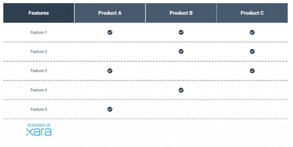
While a table chart is a typical table that can be used for many purposes, a comparison table is a type of table used to compare different items or data sets. It’s a specific type of table chart, so to speak.
It typically includes rows and columns of data, with each row representing a specific item or data set and each column representing a specific characteristic or data point.
The beauty of comparison tables and table charts is that they can be used to present a wide range of data. For example, you can use a comparison table to present data on different products or services, comparing their features, prices, and benefits. You can also use a table chart to present data on sales, revenue, or customer demographics. The possibilities are endless.
Benefits Of Using Comparison Tables and Table Charts
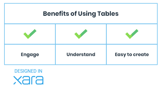
As a business professional, you know that data is key to making informed decisions. But when it comes to sharing data with others, it can be complex to communicate complex information in a way that is easy to understand. That’s where comparison tables and table charts come in.
Visualizing data allows you to present complex information clearly and concisely, making it easier to understand.
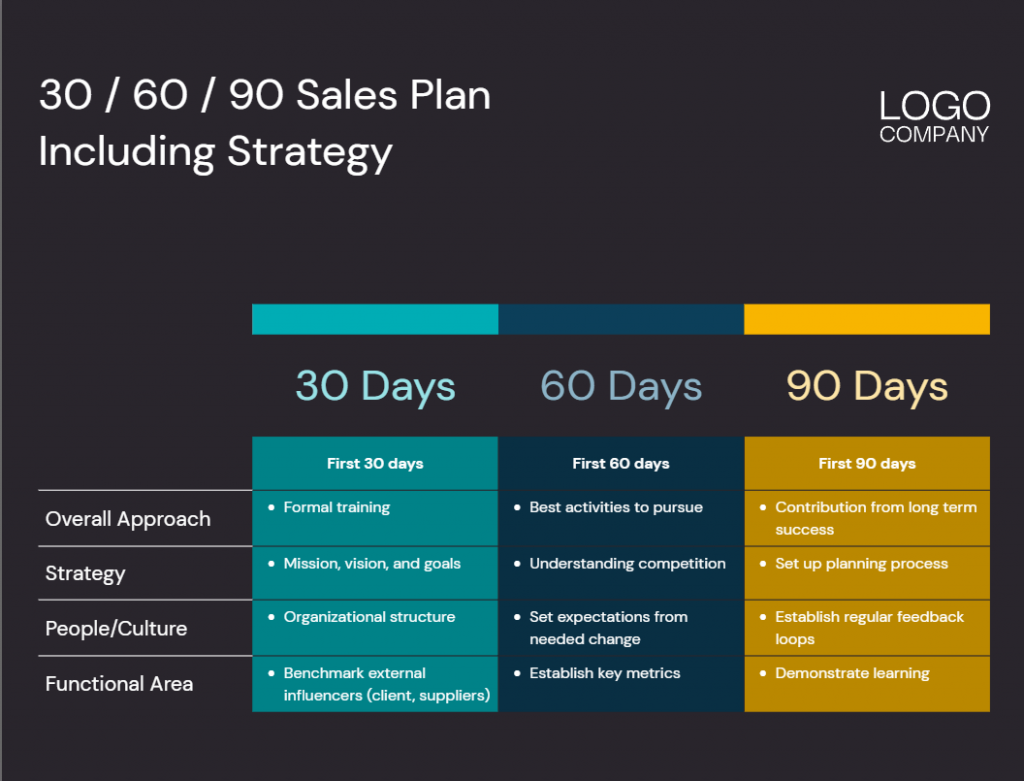
Structuring data in a visual way also helps you understand trends and patterns, and it can help with problem-solving. For instance, a table can help you create a 30/60/90 sales plan. Or you could use them to set SMART goals.
When to use Tables vs Other Diagrams?
When it comes to data visualization, choosing the right method is key. When should
You can use a table when:
- You want to showcase the features and benefits of your product.
- You want to compare products or data.
- You have too much data for a diagram to be comprehensive.
- You need to present specific data in your presentation.
Other diagrams may be suitable when:
- Illustrating trends.
- Illustrating the relationship between different types of data.
- Visualizing representing data.
6 Comparison Table and Table Chart Design Tips
To create engaging data visuals, there are a few things you need to keep in mind. Here are our top tips for creating a comparison table or table chart that will really make your data stand out:
1. What Type Of Data Do You Want To Present?
 Source
When it comes to data visualization, one size does not fit all.
Choosing the right comparison table or table chart type is crucial to effectively communicate your message. But how do you know which type to choose? It all starts with understanding your data.
For example, a simple comparison table may be the way to go if you have a small amount of data to present. Like when you want to compare pricing plans or showcase features and benefits. Similarly, you can use a table chart to present data on sales or customer demographics.
Suppose you have a large amount of data or complex relationships between data. However, a different diagram with interactive elements, such as a pie chart or bar graph, may be more appropriate in that case.
2. What’s the Story?
 Source
Once you’ve chosen the right type of comparison table or table chart, it’s time to organize and present your data to showcase the story you want to tell.
Telling a story is better than just presenting dry data. Because it keeps people all eyes and ears on what you have to see.
So, find a way to make data come alive by telling a story.
How does the data relate to your audience? What problem does it solve for them? How does it make their lives better?
By answering these questions and weaving them into your comparison table or table chart, you’ll create a narrative that is easy to understand and emotionally engaging.
So – before you organize and design your tables, have a clear idea of the story you’re trying to tell.
3. Prepare Your Data
 Source
Before you get to the table chart design, you want to ensure that your data is complete and accurate.
Your best bet is teaming up with someone for a crosscheck. An extra pair of eyes can help you spot errors quicker.
The last thing you want is to find yourself in a business meeting with inaccurate information.
4. Table Chart Design
 Source
When it comes to the table chart design, simplicity is vital.
Your audience will likely be inundated with information if you overcrowd the table or provide too much information. Remember the story you’re trying to tell with your data and keep it as simple as possible.
To help your audience understand your table, use clear headings. These will guide them as they go through the comparison table. Use whitespace in your comparison tables and table charts to separate different sections.
Now that you’ve organized your data in a clear and easy-to-read manner, it’s time to add some design elements to draw attention. Color coding is a great way to draw attention to specific data points. For example, you could use red to indicate negative data and green to indicate positive data.
To make your comparison tables memorable, play with creative fonts and use contrasting colors. And if you want your brand to stay top of mind, include your brand colors and logo. Interesting shapes can also be added to the mix for a bit of spice.
But don’t overdo it.
5. Use a Mobile-First Approach
 Source
If there’s any chance that your audience will use their mobile devices to read your comparison tables and table charts – you have to go with a mobile-first approach when you design the tables.
One tip would be to keep the design simple and use large enough text to be legible without zooming in. Locked-in headers are also effective at guiding your audience. If you have a table packed with information, you can add user-selected criteria so people can filter the information they want to see.
Another tip would be to upload images or PDFs of your tables. This is especially useful for social media posts or when you want to highlight critical information throughout your blog posts.
Whatever method you choose, make sure you check yourself before you wreck yourself. Always preview your tables on mobile devices before hitting “publish”.
6. Spice Up Table Charts With Images, Icons and Stickers
To get rid of boring, old-school table charts, you’ll want to add images, stickers, and icons to your tables. These will add some well-needed visual interest to your data.
Not only do they make your tables memorable, but they can also help to clarify and explain your data more intuitively.
For example, you could use an image of your products to represent data on sales. Or an icon of a house to show how many properties you sold in the last month. Stickers or icons with different facial expressions can be used to represent customer satisfaction!
Besides being visually engaging, images, icons and stickers can also help to make your data more accessible. For example, if you’re working with data that includes many numbers and statistics, adding images and icons can help break up the text and make it easier to read.
Xara Cloud offers a wide variety of images, icons, and stickers that you can include in your table charts. Make your data pop with Xara Cloud! Try it now →
What Kind Of Comparison Table Is The Right One For You?
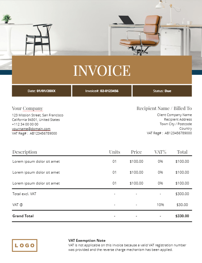
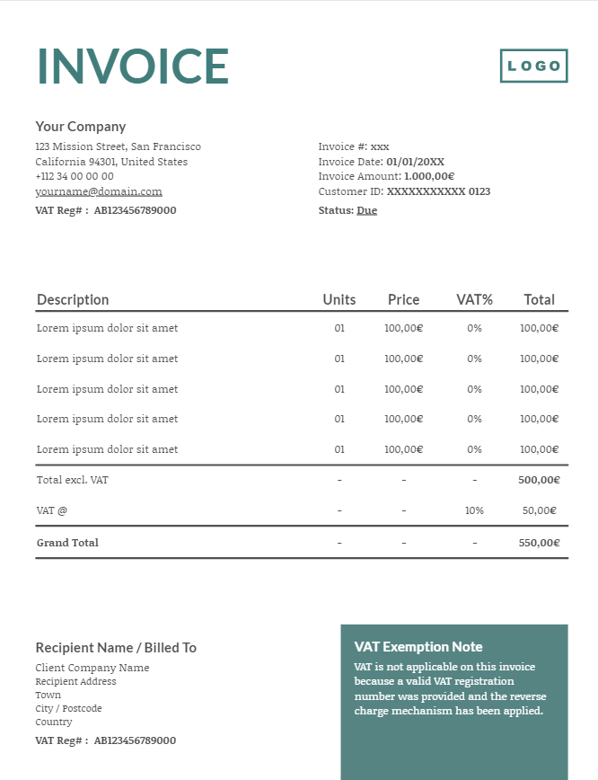
Comparison Table For Your Invoice Bill
 Go to template →
  Go to template →
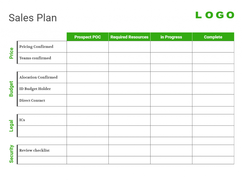
Comparison Table For a Sales Plan
 Go to template →
  Go to template →
Table for Competition Comparison
 Go to template →
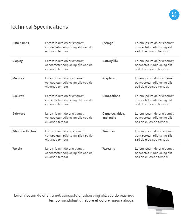
Comparison Table for Product Sheets
 Go to template →
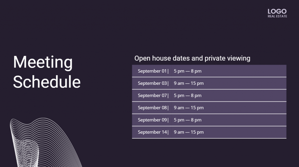
Comparison Tables for Scheduling and Task Management
 Go to template →
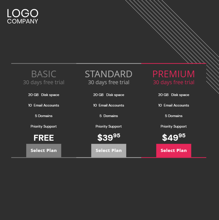
Comparison Table for Showing Pricing Plans
Created with Xara Cloud
How To Create Comparison Tables and Table Charts With Xara Cloud
1. Create a Xara Cloud Account.

2. Choose a template.
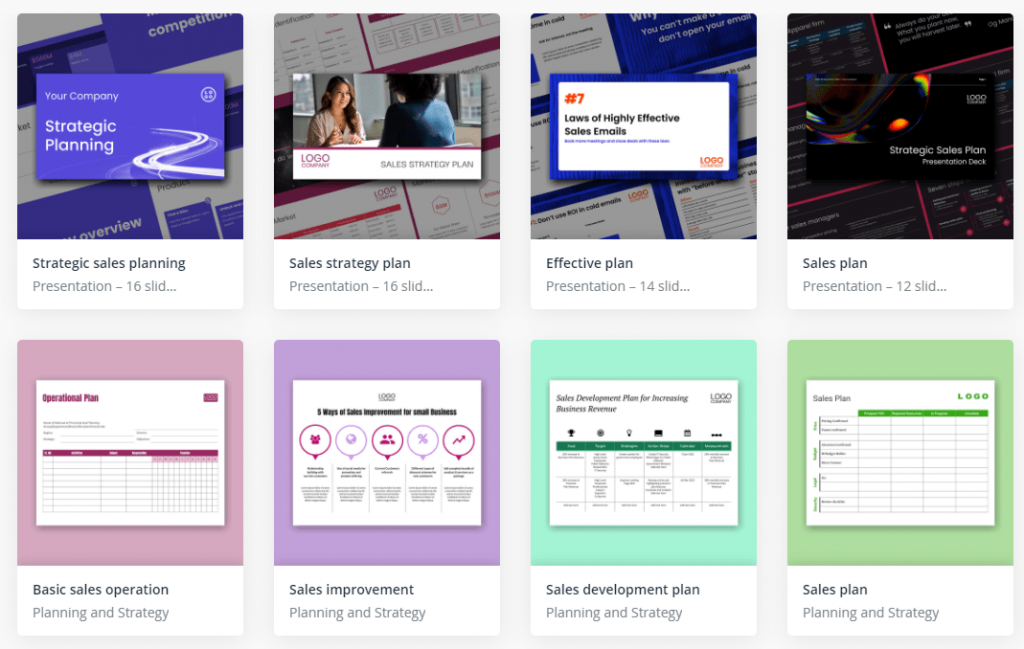
Enter the template library and find the right design template for you! Find the best ones for your needs using the right categories or typing in a keyword.
Find the best ones for your needs using the right categories or typing in a keyword.
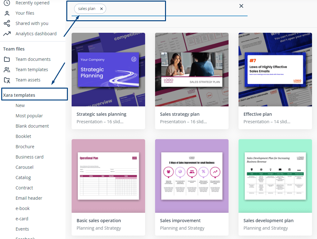
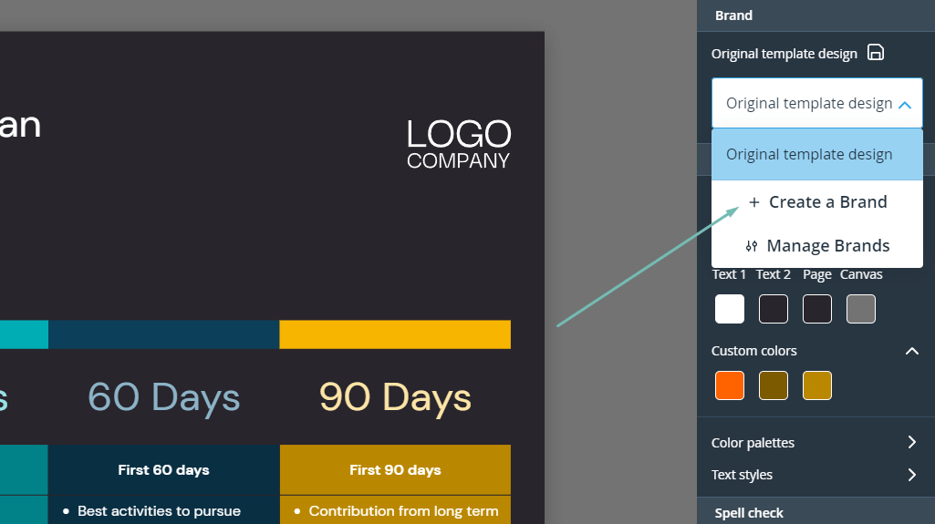
3. Click on “Create a brand” to add brand elements, such as a logo, fonts, and brand colors.
We know that brand consistency equals consistent success. The brand management feature will ensure that each of your posts is automatically branded.
4. If the chosen template doesn’t include a table, choose a table template.
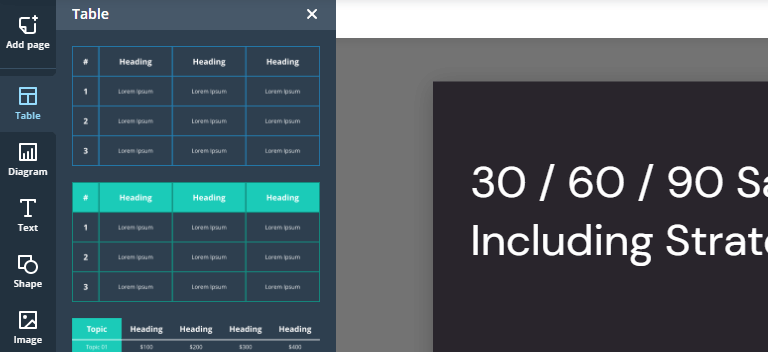
There is no end to the use of our versatile table templates. With our table templates, you can compare products, show features and benefits, or present sales data.
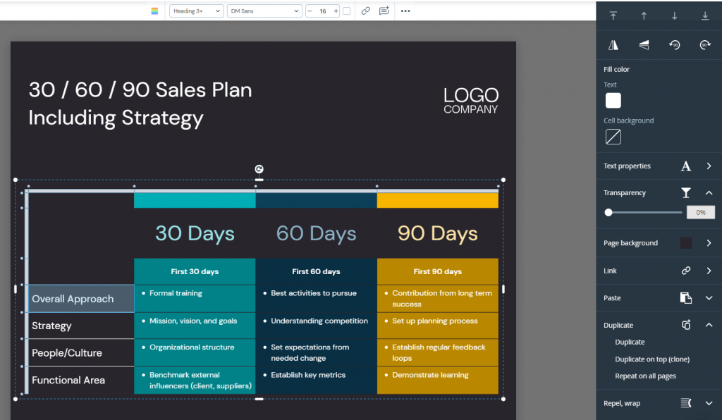
5. Customize your table.
6. Download or share your post with the world!
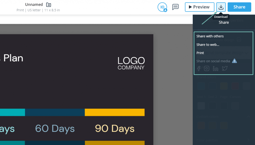
To distribute content, Xara Cloud provides you with 4 options:
- Download the content.
- Share to the web.
- Print.
- Share on social media platforms.
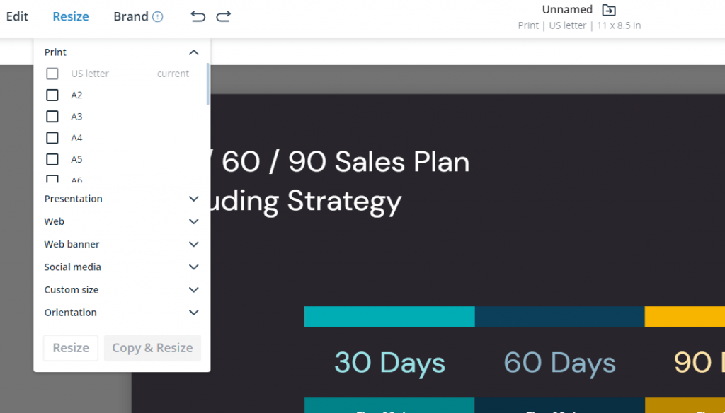
You can automatically resize your post to fit social media requirements by using the “resize” feature.
Our Socialbee integration allows you to share posts on social media with just one click.
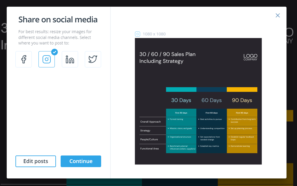
Just connect your social media profiles to Socialbee and share your social media carousel posts with your audience. It’s that easy.
If you’re looking to post when users are active, you can schedule your posts, sit back, and relax!
Make Your Tables Stand Out WIth Xara Cloud
Creating comparison tables and table charts that convert don’t have to be a daunting task. By following the tips and tricks in this guide, you can create tables that are easy to understand.
And, most of all, memorable.
But what if we told you that you could speed up the work process and make the task even easier?
Introducing Xara Cloud’s table templates and online table maker. With pre-designed templates and a user-friendly interface, Xara Cloud’s table maker makes it easy for anyone without design experience to master the art of creating comparison tables and table charts that convert.
Don’t let the design process stop you from creating comparison tables and table charts that genuinely stand out. Give Xara Cloud a try and see for yourself how easy it is to create memorable and impactful tables and charts.
Create your converting comparison table!



 No credit card or phone number required.