There is no doubt about the importance of data and data visualization, so let’s take an in-depth look at data visualization techniques that you can use today.
The first question — how do I decide what is the right chart for my data?

Choose the type according to your need
There are 50+ different types of charts to visualize data. It’s important to select a data visualization type that ensures your message is clear and accurate. Choosing a wrong visual can lead to data misinterpretation. Consider your variables and number of data points. Do you need to make a comparison or show progress of projects over time? Here are a few basic tips that can help you generate the best visuals:
First, you have to understand the data you’re trying to visualize, including its size and variables
Secondly, determine what you want to visualize and what kind of information you want to communicate
Thirdly, understand how your audience is processing visual information
And lastly, choose a visual that conveys the information in the best and simplest way for your audience
The basic visualization types
Line, bar and column charts
These are probably the most common chart types, and ones we’ve all used before. You can use them to represent a change over time, to compare different items, like categories, to highlight differences or to show trends. To support variance, like different statuses or ranges, you can use different colors, but otherwise use a single color, or shades of the same color, instead of using too many colors.
Pyramid and pie charts
Pyramid and pie charts are most effective when there are limited components (categories to compare) and when text and percentages are included to describe the content. They are used to display parts-of-a-whole. To successfully get your point across, avoid comparing too many categories with very similar values. As key points can get lost easily, use them alongside other charts in your presentation.
Process and structure diagrams
When it comes to project management, charts like a Project Phase chart or Gantt chart are commonly used. They can help to visualize the whole life cycle of your project, detailing its phases and activities, or illustrate what needs to be done, in what order, by whom and by what deadline.
Best practices of data visualization delivery
Whether you’re creating an infographic, putting together a presentation, or working on a full-length report, the visual representation of data in your content is a must. When making your data visual, it’s easier for your audience to process compelling insights so you can increase attention, retention and engagement at the same time. Here are a few best practices for how to deliver your data visualizations to your target audience, which could be internal and external.
Your Marketing Reports
According to a survey, 87% of organizations stated that data is the most underused asset within their marketing departments. And yet data is crucial for marketers to understand and convey which marketing actions have been successful, and which ones haven’t. Having said that, avoid including too many metrics in your marketing reports, as it can become confusing very quickly. Keep in mind that you should build your dashboards around one specific topic only. Potential topics that need support by data visuals in your report typically include monthly highlights, target markets, reach by channel, lead generation, website visits, new customers, social media performance and more…
Have a look at the example report to get a better impression:
Get exemplary marketing reportYour Internal Reporting (e.g. Townhall Presentation)
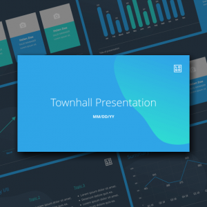
As more and more organizations are moving towards transparency as a mean to increase employee engagement and retention, monthly “townhall presentations” in which a company’s data is shared are getting more popular. Data visualization makes such internal presentations digestible for everyone, regardless of comfort level with analytics. Focus on presenting the main revenue/profit/expense data in a compelling way to avoid listeners tuning out during the presentation.
Have a look at this example townhall presentation to get a better impression:
Your Investor Presentations
Using raw data to educate your stakeholders on your company’s performance is not a good idea. Make use of free data visualization tools to showcase the data they care about most in a visually compelling way, that doesn’t need extra guidance to be understood. In that way, your regular meetings with investors can be focused on building strategies based on that data, rather than scouring through the numbers. Also, for your first presentation in front of potential investors, like a pitch presentation, make sure to focus on the important topics and keep data visualizations easy to understand.
Have a look at the example pitch deck to get a better impression:
To start with another business template from our library, go to cloud.xara.com.
Sign up to Xara today for a free trial


 No credit card or phone number required.